
PARK HILL HAS ITS OWN TYPEFACE.
Park Hill has its own typeface, in two styles: Regular & Hardcore. Inspired by the iconic Brutalist architecture of Park Hill, the typeface is a celebration of the history of the site’s past, present and future. It’s free to download and share.
STREETS IN THE SKY — TYPEFACE FROM ABOVE.
The Park Hill typeface began as an observation of the accidental typographic forms created by the footplate of the buildings which form the Brutalist housing development. From above, a well defined S shape can be seen surrounded by what might be described as other fractured letterforms. At street level, the footbridges which connect the large blocks, also have a typographic character.


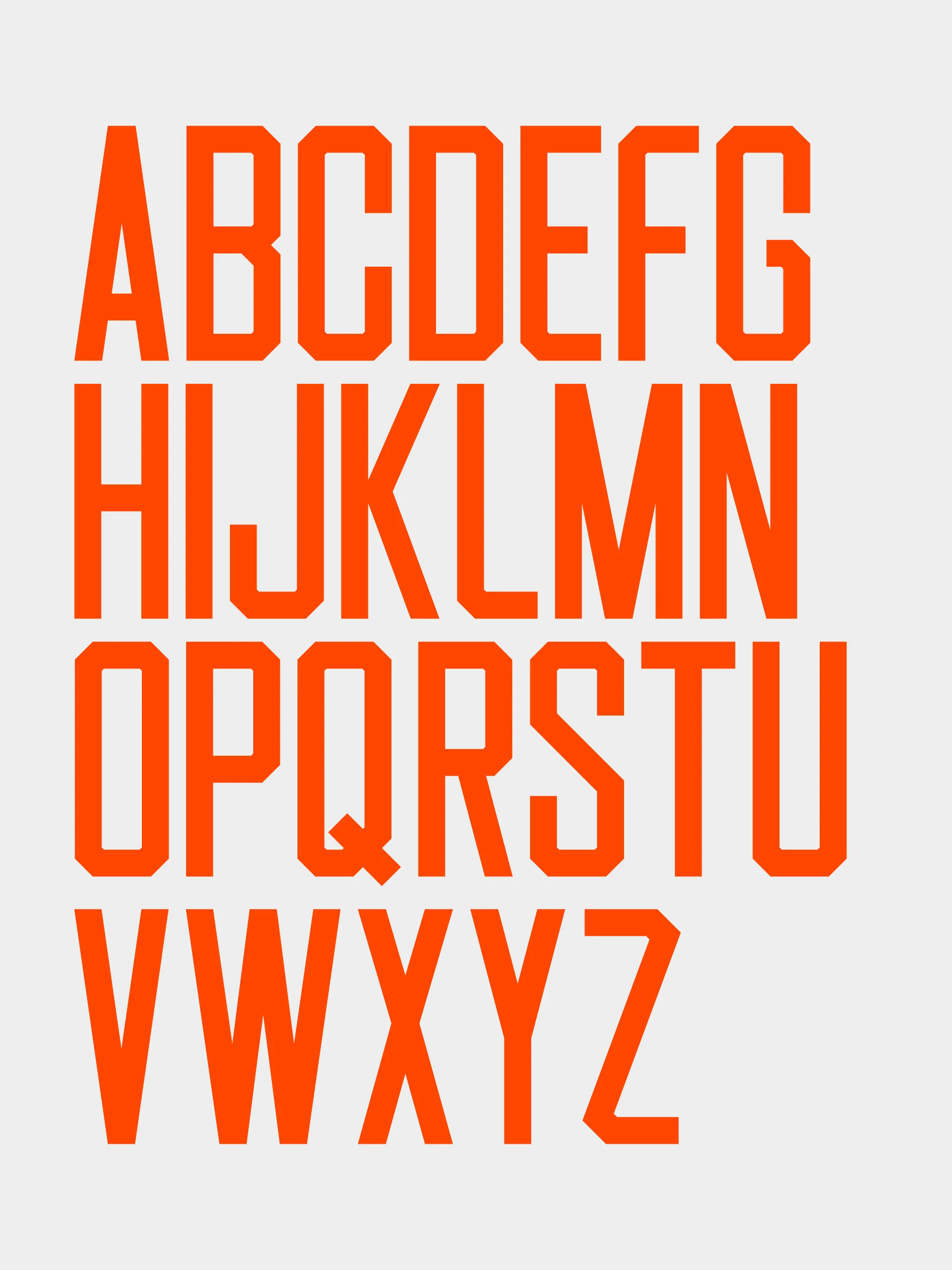
Park Hill Regular
Park Hill Regular has been drawn to reflect the character of the site’s architectural footplate whilst retaining a legible and functional style. The condensed proportions echo the style of typefaces commonly found on Brutalist architecture and estates built during the same period as Park Hill.

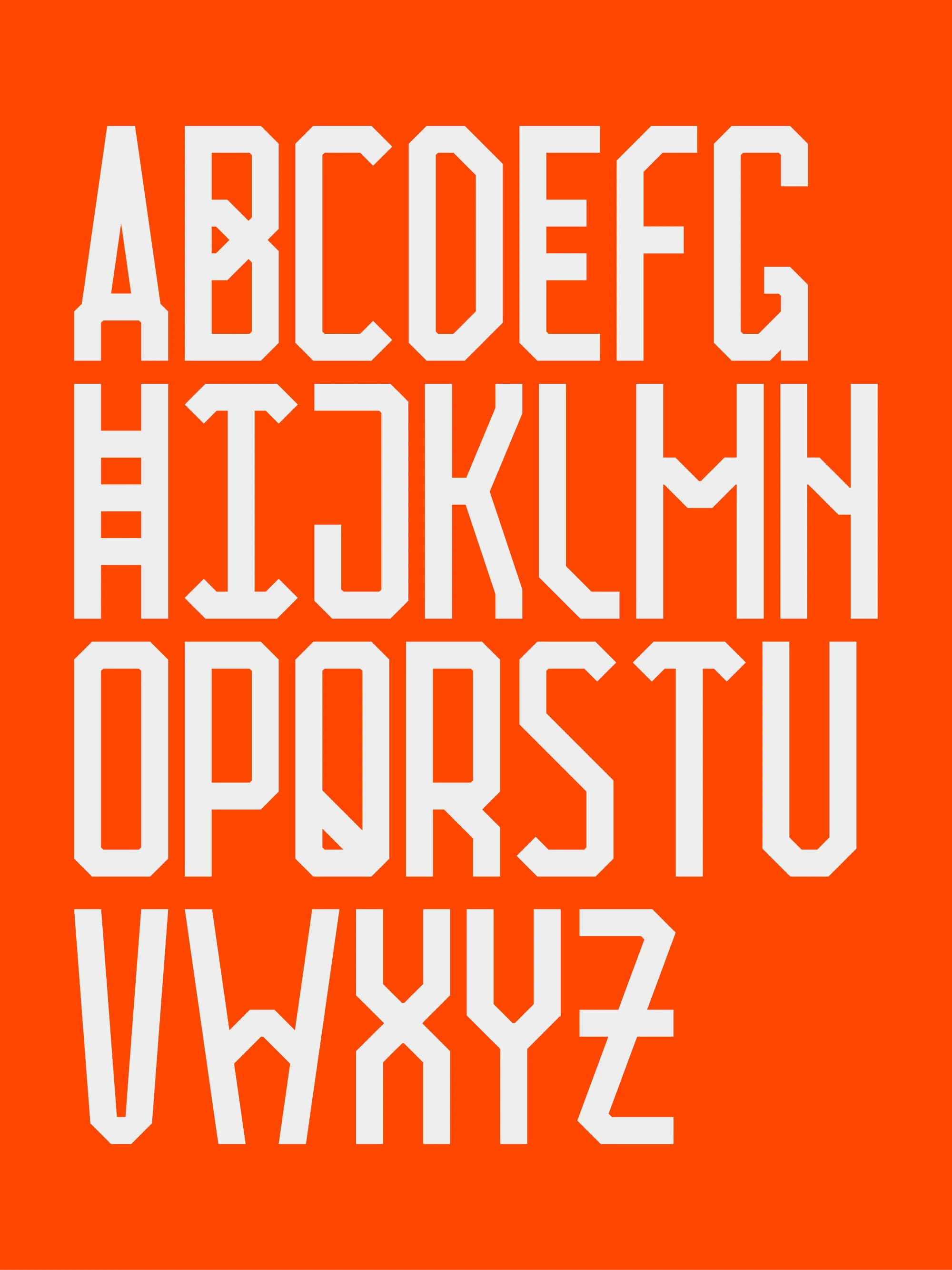
Park Hill Hardcore
Park Hill Hardcore offers an alternative set of characters which explore the character of the site in bold graphic detail. Its letterforms reference details from the architecture such as the elevated footbridges (characters E & H) and the 45 degree corners of the building footplate (characters D & F). The name ‘Park Hill Hardcore’ is both a reference to the building material and the album title by Sheffield band Pulp, This Is Hardcore.


MIX, CREATE, SHARE.
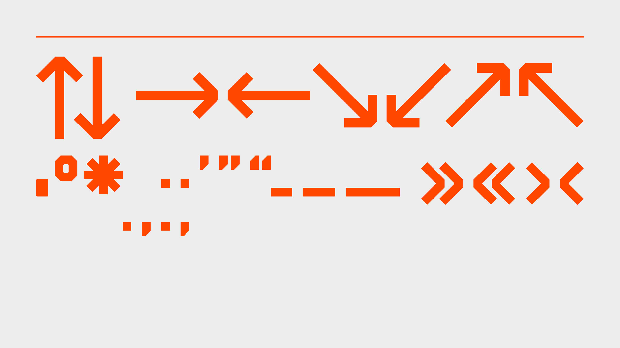
The Park Hill typeface is free to download. The two styles can be used in a number of ways; either as individual typefaces or as a combination – mixing characters from both versions to add character and detail.
Park Hill Regular
The condensed proportions make it ideal for titles, particularly at large pt sizes where the architectural angles become more prominent.
Park Hill Hardcore
The exaggerated architecture of the letterforms are great for adding character to the Regular style, or used for bold graphic titling.


ABOUT THE PROJECT
Designed by Founded, commissioned by Alumno Group and Matthew Jarratt, the Park Hill typeface accompanies the ongoing development of Park Hill into a thriving new community with new homes, nursery, workspaces and student housing.
Park Hill
Set in 32 acres of green space overlooking Sheffield city centre, the Park Hill Estate was built between 1957-1961. It was designed by architects Ivor Smith and Jack Lynn under the auspices of Lewis Womersley, the chief architect of Sheffield’s housing committee. Park Hill contained around 1,000 flats to house the people of Sheffield and is a true landmark of the Sheffield city skyline.
The building is also internationally recognised as an icon of Brutalist architecture, being loved and loathed in equal measure.
The original Park Hill Estate contained all the amenities that residents needed, including children’s play spaces, pubs and shops, all intended to foster a strong sense of community, within close proximity to the city centre.
The flats themselves were dual aspect, all facing south or west, each with their own generous balcony. Flats on the middle of the three floors were accessible off a “street-in-the-sky”.
English Heritage placed a Grade II* listing on the entire estate in 1998.

Phase 3 block in the early 1960s. RIBA library